

Using the right fonts in California courts is important for legal professionals looking to be as smooth as possible in their cases, but what is the right font?
When the focus of your briefs must be the content and conveying vital information to support your case, it can be easy to keep the visual details of the actual page set at the minimum standards of the law.
However, with typography, the visual component of the written word, you have the opportunity to make your documents stand out and create a positive reading experience for the judges and clerks who will be looking at them.
The font is only one of many aspects of typography, and something we’ve been getting a lot of questions about lately. So here is a summary of our philosophy when it comes to the ideal fonts in California courts for legal documents.
Legal document font style and size
There are many standards that are broadly conformed to at the federal level. Let’s use this opportunity to go over several aspects of font and style that are applicable in many differing jurisdictions:
Font type
Proportionally spaced fonts are preferred for legibility.
Commonly used fonts:
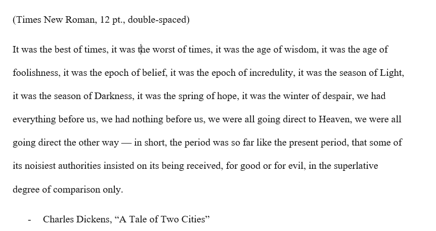
- Times New Roman
- Arial
- Calibri
- Helvetica
Font size
The minimum font size is usually 12 points for the main body of the text.
Some courts might accept 11-point font for footnotes or smaller sections, but it is safer to stick to 12 points unless otherwise specified.
Margins
Typically, margins should be at least 1 inch on all sides.
Spacing
Double-spacing is the standard for the body of the document.
Single spacing may be used for certain elements such as block quotes, footnotes, and captions.
Headers and footers
Headers often include the case name, case number, and sometimes the name of the document.
Page numbers are typically placed in the footer or header.
Indentation
The first line of each paragraph is usually indented.
Alignment
Left alignment is standard for the main body of text.
Some elements, like headings, may be centered.
“Essentially equivalent”
When making recommendations for fonts used in documents that will be eFiled in the California court, we consider both the court rules and overall readability.
Court rules
As shown above, California Title Two rules state that the fonts used in submitted documents must be “essentially equivalent” to Courier, Times New Roman, or Arial. The law does not require your document to be in one of these fonts, just that the font you use is similar to these standard system fonts.
For filing legal documents into California courts, it’s important to adhere to the specific formatting and font requirements set by the court.
According to the California Rules of Court, Rule 2.104, the font and formatting requirements are as follows:
Matthew Butterick, in his book Typography for Lawyers (which we have discussed before and highly recommend), has a straightforward explanation of his interpretation:
“If the rules call for a specific font or point size, use it. For instance, Florida Rule of Appellate Procedure 9.210(a)(2) requires either 14-point Times New Roman or 12-point Courier New. In that case, you have no discretion. Follow the rule.”
He continues,
“If the rules call for a font that’s similar to a particular font, use your discretion carefully. For instance, Calif. Rule of Court 2.105 requires a font that is “essentially equivalent to Courier, Times New Roman, or Arial.” I take this to mean you should use a font that has the general legibility and length characteristics of Courier, Times New Roman, or Arial…I don’t take the rule to mean you can only use those three fonts. If the rule meant that, it would have said so.”
We know, in fact, that other states, like Florida, do require lawyers to use very specific fonts to file documents in. Massachusetts, Alabama, and New Jersey “essentially force” appeals court attorneys to use Courier, an old-fashioned typeface that was designed in the lettering of electronic typewriters. There is no room for interpretation, that is the requirement.
So, when California gives three different traditional fonts as guidelines, we take that to mean that they are looking for professional fonts in the style of those three traditional choices rather than a single static option.
Why is it important to follow the rules of the court when using fonts?
Readability
Let’s dig a little deeper into the readability aspect of using the right fonts in California courts.
Many of these documents will be viewed by judges and clerks on a computer or tablet rather than on paper. So we approach readability from that point of view: what will make documents look the best and be easiest to read and understand when seen on a screen?
Here are two examples of block text, similar to what might appear on a document of your own in length if not in content. Both examples technically meet the standards of the court rules, but one offers a better reading experience.
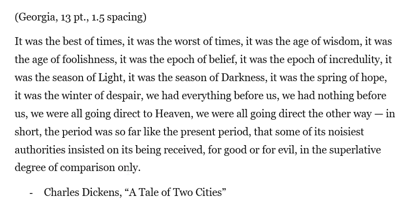
Based on our experience, we recommend Cambria, Georgia, or Helvetica fonts, 13 pt. font type, and 1.5 line spacing. Again, either of the above options will be accepted by the court, but when you’re looking for your documents to not just be accepted, but also to convince and support your overall case, the font can go far to help.
Conclusion
When laying out its requirements for what fonts in California courts are broadly acceptable, the courts are establishing minimums, maximums, and expectations for your documents.
Unless it specifically states that a font size be X, or that a brief be written only in Y, you do have some latitude over how your documents appear.
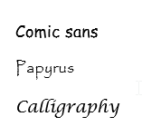
Courts did not want to have to wade through documents written in:
But if you are using a professional, legible font that is “essentially equivalent” to the traditional fonts that we have long known, and “If your typography conforms to the court rules in good faith, you should be on solid ground.” (Butterick)
In fact, in our 25 years of experience, we have seen documents get rejected for a variety of reasons, but almost never related to font type, and that never on documents that were written in one of the three fonts we suggest.
In recent months, the only times documents have been rejected for font-related reasons were when the font size was too small.
What is the takeaway for best practices in formatting your document?
Bigger is better. Choose the improved font. Left justify. Embrace white space. Aim for readability.