


“Typography matters because it helps conserve the most valuable resource you have as a writer — reader attention.”
So says Matthew Butterick, a graphic designer-turned-lawyer who has authored a book called “Typography for Lawyers”, which seeks to bust a lot of presentational myths that persist in the legal profession, and suggest ways legal documents can be made easier to read.
Okay, so the font you choose, the size of your subheadings, and the spacing of your paragraphs obviously isn’t likely to be your primary concern when working on legal documents. That said, since the purpose of your writing is often to persuade people of a position or to convey certain important information, it’s essential that it is easy to read and understand. Here, typography matters.
That’s because a badly-formatted page or one written in a difficult-to-read font requires the reader to devote their energy and attention to the mechanics of reading rather than your message. Today, with many important documents electronically filed and only ever read on-screen — a medium that’s been proven to negatively affect a reader’s ability to focus — good typography matters more than ever.
Learn how to improve the readability of your legal documents with our free legal writing ebook >>
Choose your font carefully
There are still a handful of courts out there that haven’t yet received the memo about the demise of the typewriter and still insist all filings be in courier font (the one that looks like typewriter letters). California, for example, doesn’t require it, but does still list it in their rules as one of the font-types an attorney’s final choice must be “essentially equivalent” to (CRC, 2.105).
Courier, and other similar monospaced fonts (so named because every character is the same width), served a single purpose — to suit the mechanical requirements of typewriters. They weren’t designed to be easy to read or attractive on the page.
So, what should you use instead? Some would argue that the most readable fonts are sans serif (straight, with no flicks). That’s certainly true for signs, headings, and other pieces of information that will be glanced at. It’s why Helvetica has been used the world over for signage in public transit systems, for example.
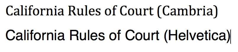
There’s some evidence, though, to suggest that readers are better able to recall information from longer pieces of writing when they’re typed in a serif font (curvy, with tail flicks). Times New Roman is an acceptable choice, but other system fonts (fonts found by default in programs like Microsoft Word), such as Cambria and Georgia are better (both, by the way, meeting California’s requirements).
Give your words some space on the page
Often there’s a temptation to squeeze as much information as possible onto the page. A big wall of text is, however, very hard to read and difficult to stay focused on for very long — not ideal. The answer to readability is to embrace white space on the page. Here are five quick ways to better utilize white space to improve readability (all well within California’s court rules!):
- Break up text with headings and sub-headings — Introduce new sections with a heading or sub-heading that summarizes what’s to come. Capitalizing each word in a header is up to you, but note that it is often easier to read when written in sentence case.
- Left align (rather than justify text) — The Chicago manual of style says it better than I could: “Use left alignment. Full justification is ugly and more difficult to read.”
- Use 1.5 line spacing — A healthy gap between lines vastly improves readability and makes it much easier to scan for particular pieces of information. California’s rules state that either 1.5 or double line spacing can be used. Double line spacing creates unnecessarily large gaps, so choose 1.5.
- Set larger left and right margins — There are few professional publications that use letter-sized paper and small one-inch margins. Why? Because this often results in more words per page than is comfortable to read. California sets minimum margin sizes, which you’re welcome to exceed. Try setting at least 1.5 inches left and right.
- Use 13 pt, rather than 12 pt font — Now that eFiling is so prevalent, and on-screen reading is a real possibility, you need to format for on- and off-screen readers. In California, the minimum is 12 pt, but a little larger will be easier to read, especially on a smaller screen, like that of an iPad.
Be consistent
If you’re going to go to the effort of overhauling your typography for maximum readability, then it’s vital you’re consistent. Abrupt changes mid-document or changes in fonts from one letter to the next will imply a lack of care, attention, and professionalism.
Establishing a style guide for your firm, specifying preferred margin widths, line spacing, font styles, and so on will go some way to achieving this. One of the easiest ways to ensure consistency, though, is to make use of the “Styles” functionality in Microsoft Word. It’s crucial to learn what a style is and to set yours up according to your firm’s preferred approach.
Styles also help to ensure consistency between staff because the same default style set can be deployed on every employee’s’ computer.